
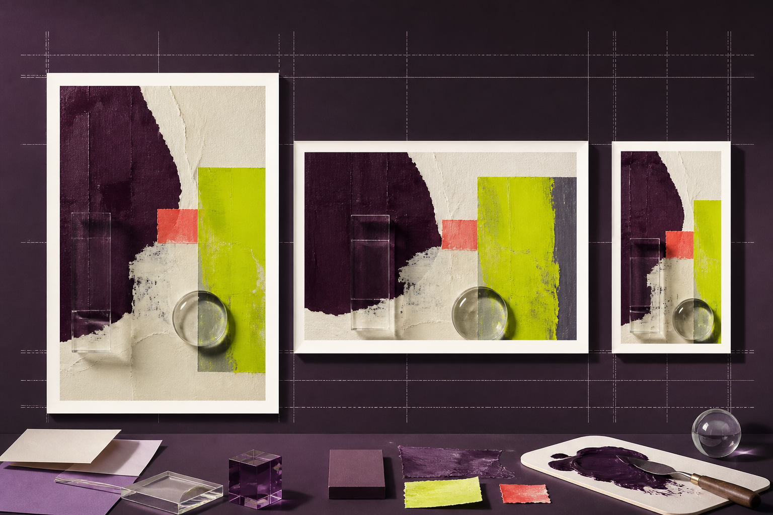
Resolution becomes useful only when it is tied to a destination. Begin with the largest approved placement, calculate the pixels that placement needs, and create smaller derivatives from a controlled master. This avoids both soft output and unnecessarily heavy files.
Separate pixel dimensions from print density
A digital image has a fixed pixel width and height. Print adds a relationship between those pixels and physical size, commonly expressed as pixels per inch. Changing the density tag alone does not create detail. For a 10-inch-wide print at 300 pixels per inch, the working target is 3,000 pixels wide before bleed and crop allowances.
For screens, CSS layout, device density and responsive selection all affect what a visitor receives. W3C responsive image guidance describes art direction and resolution switching as distinct needs, which is why one giant file is not a responsible universal answer.W3C responsive image use cases ↗
Build a placement inventory
List each approved format with aspect ratio, displayed dimensions, crop tolerance, text-safe area and expected viewing distance. Include the actual content management or ad-platform constraints. A portrait social crop may need a different composition, not simply a smaller export of a landscape master.
For print, ask the printer for final dimensions, bleed, colour profile and preferred file format. For web, test the image in the real component and network conditions. For social channels, verify current requirements in the publishing interface because platform processing can change.
Choose a sensible master
Keep a colour-managed master large enough for the biggest credible use, but do not manufacture dimensions without reviewing the result. An oversized master full of invented texture is not more truthful than a smaller, clean file. Retain the original separately so future outputs are not derived from a compressed derivative.
Colour behaviour is part of output planning. ICC profiles provide the mechanism for communicating colour characteristics across devices and workflows. Confirm the printer or destination profile instead of silently converting every file to the same space.International Color Consortium ↗
Verify each derivative in context
Open the exported file, confirm dimensions and inspect the important crop. Then view it in the page, template or print proof where it will appear. Check subject priority, text legibility, edge halos, file weight and any platform recompression.
Store the output specification beside the campaign files. When a placement changes, regenerate from the controlled master rather than stretching the nearest existing derivative.
Work backwards from a print placement
Suppose an image will occupy 240 by 160 millimetres in a brochure. Convert the required physical dimensions using the printer’s requested sampling density, then add bleed and allow for the selected crop. Check the effective resolution after the image is placed in layout, because a designer can reduce or enlarge the frame after the export was prepared.
A proof should answer more than whether individual pixels are visible. Review subject scale, local contrast, fine lines and colour on the intended stock or a credible simulation. Large-format work viewed from several metres may tolerate lower sampling density than a book held close, while fine product labels can still demand targeted attention.
Plan a responsive web family
Begin with the component’s maximum rendered width, then identify useful breakpoints instead of exporting a file for every device. A 640-pixel card, 1280-pixel content image and 1920-pixel hero may cover the real layout better than ten nearly identical derivatives. Keep aspect ratio and focal point data beside the asset when crops change across breakpoints.
Test on a normal mobile connection and inspect which resource the browser actually loads. The technically sharpest image is not the best choice if it delays the main content or shifts the layout. Reserve high-resolution variants for screens and placements where their visible benefit justifies the transfer cost.
A practical decision table
| Destination | Start with | Final check |
|---|---|---|
| Physical size, bleed and printer specification | Proof at intended scale | |
| Web | Rendered component width and responsive variants | Layout, weight and sharpness |
| Social | Current placement ratio and safe area | Platform preview after upload |
Release checklist
- Inventory every placement
- Record aspect ratios
- Ask for print specifications
- Allow for bleed and crop
- Keep the source separate
- Create responsive variants
- Embed the intended profile
- Check file weight
- Preview in the real template
- Archive the output specification
Common questions
Is 300 pixels per inch always required for print?
No. The suitable density depends on the process, material, viewing distance and printer requirements.
Should web images use the largest available file?
Usually not. Serve an appropriately sized variant and keep the larger master outside the page payload.
Treat social crops as compositions
A feed post, vertical story and link preview present different safe areas and interface overlays. Start with the current publishing template, move the focal subject deliberately and check whether captions or platform controls compete with essential content. Do not assume a centred crop remains suitable when the format becomes tall.
Archive the platform, placement, ratio, pixel dimensions and export date with each derivative. Platform guidance and compression behaviour can change, so this record is a production snapshot rather than a permanent universal standard. When requirements change, regenerate from the master and review again in the live preview.